The project is to rebrand and redesign the museum website to better showcase the identity of the museum and the artifacts on display.
Users were consulted before the redesign to understand their needs and intents when visiting the website. Accessibility and responsiveness designs were incorporated to offer an inclusive and seamless user experience.
The business goal is to attract more visitors to the website and the museum. The impact will be measured by the increased number of visitors to the website and the number of museum tickets sold through it.
Mo’omeheu Bishop Museum
The Challenge: Bishop Museum is a premier museum in Hawaii that showcases the rich historical culture of Hawaii and the Pacific. The museum website serves as an excellent platform to promote this culture to a global audience.
The opportunity was seen in enhancing the website's functionality and appeal to increase traffic. Improved user experience of the website can increase the attention and number of visitors to the museum.
The Redesign: Rebrand and redesign the museum website to better reflect the identity and enhance the user experience so to attract more visitors to the website and the museum.
Project Timeframe: July – August 2023
Due to the limited timeframe, the project achieved the user research and redesign of the website’s main pages, with the plan to progress to build a prototype and test with users for further refinement.
My Role:
Created the rebranded logo and brand identity using Adobe Illustrator and InDesign.
Redesigned the information architecture and visual appearance of the website using Adobe XD.
Conducted museum website research and user interviews.
DEFINE THE PROBLEM
First, I started by researching Bishop Museum’s current website to understand the museum’s mission, goals, products, services, and audience, and explored the website’s navigation, functionality, and visual elements.
Following, I carried out user research to collect users’ qualitative behavioral and attitudinal data when interacting with the website. I conducted usability tests and interviews with participants who were first-time users of the Bishop Museum website and represented the museum’s core audience.
Key research findings:
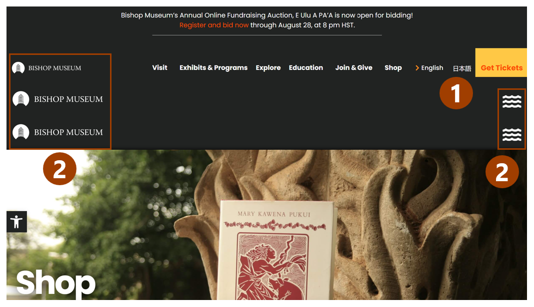
Only one user noticed the Get Tickets button. All users felt that the website’s navigation cues were not clear in guiding actions.
Users got confused with the duplicates of some components.
When testing the website on different screen-sized laptops, it was discovered that the website has a responsive problem. Different layouts are shown on different screen sizes.
Users liked the website content but thought the visual appeal could be improved for better attraction. Users would like the website to look more welcoming, using tropical colors, e.g., blue, green, and brown to represent Hawaii’s Aloha spirit.
Smaller screen laptop

Larger screen laptop
DESIGN
Website Redesign
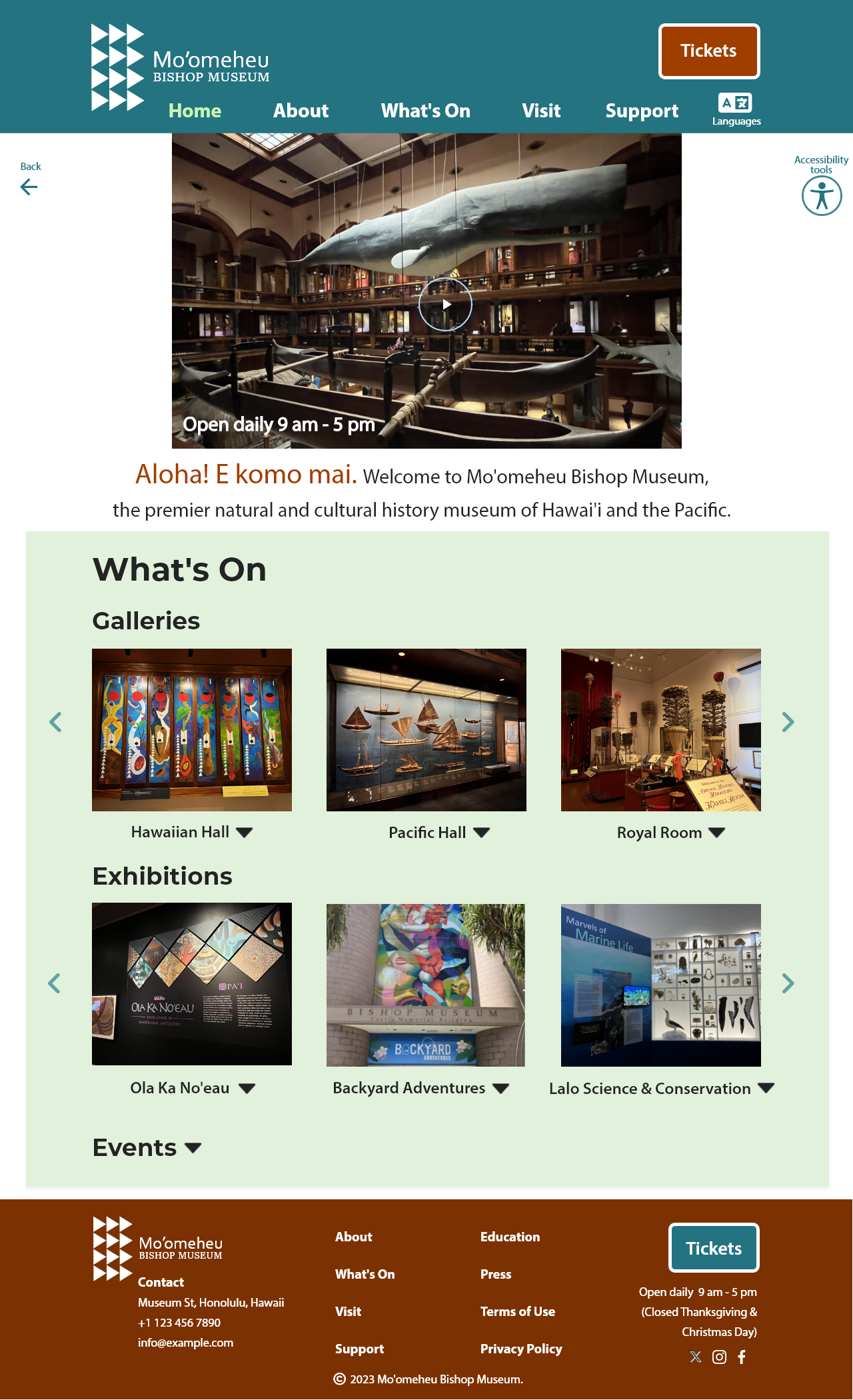
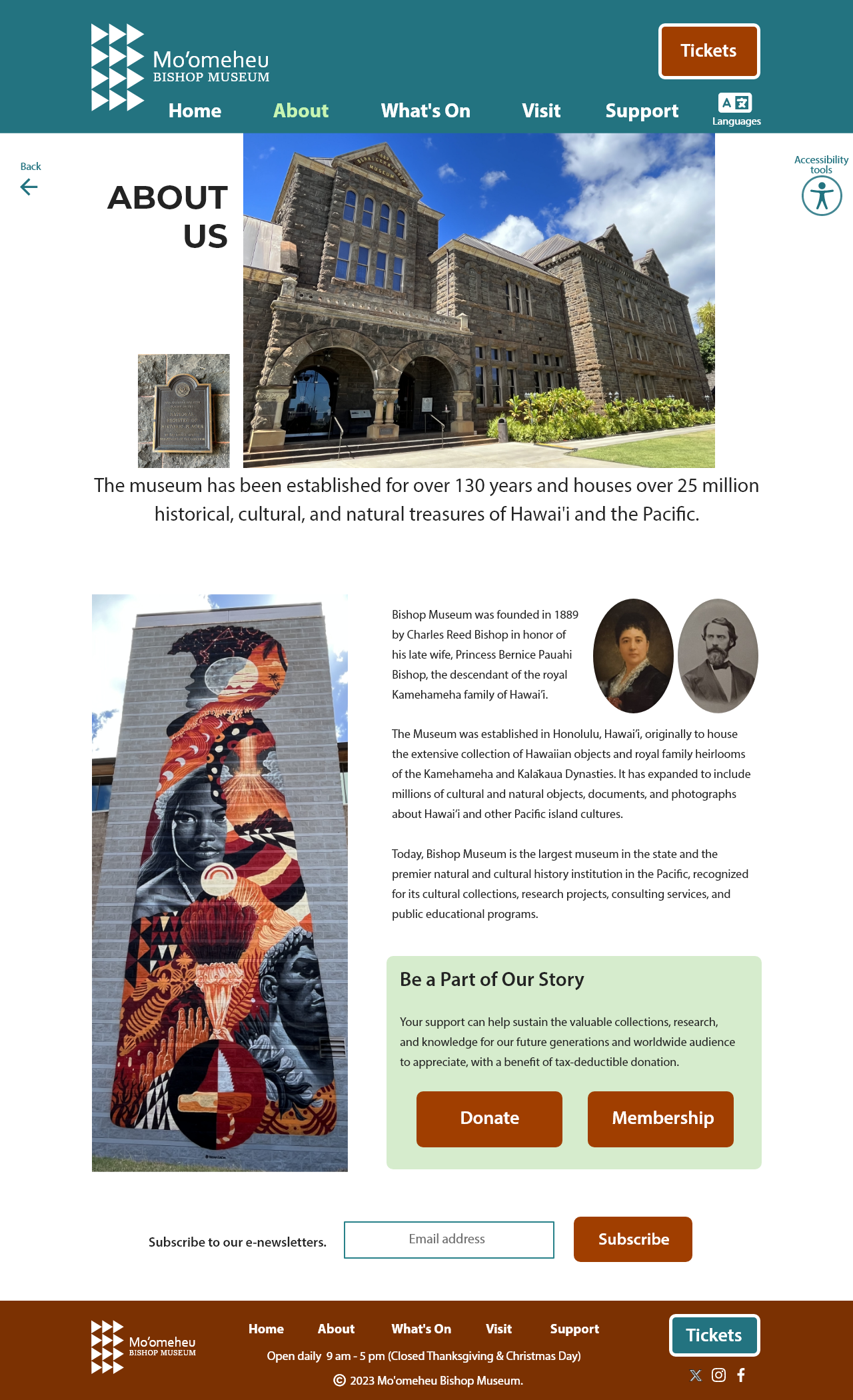
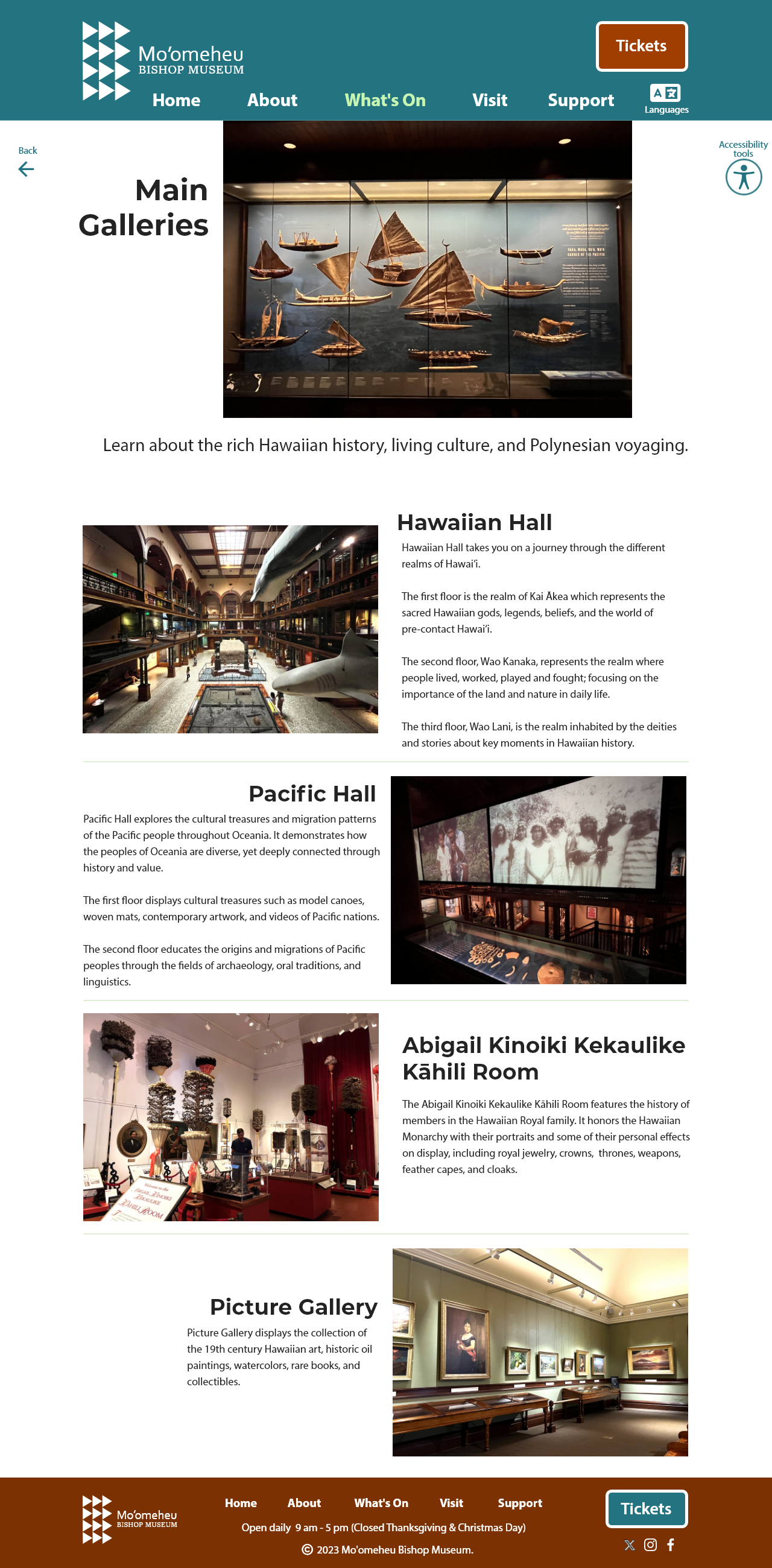
Incorporating all feedback from the users, I designed mockups of the website’s Home, About, and What’s On pages, using the brand’s typography, colors, and identity.
I simplified the navigation and placed the ‘Tickets’ buttons at both the header and footer of every page to maximize their visibility and convenience for the users and minimize the missed opportunities for the business.
Since the users like the content copy on the original website, I have not made significant changes to it.
Home page
About page
What’s On page
Note: All the images were taken on-site by me. Content copy is mainly sourced from Bishop Museum website.
THE DESIGN PROCESS
The Logo
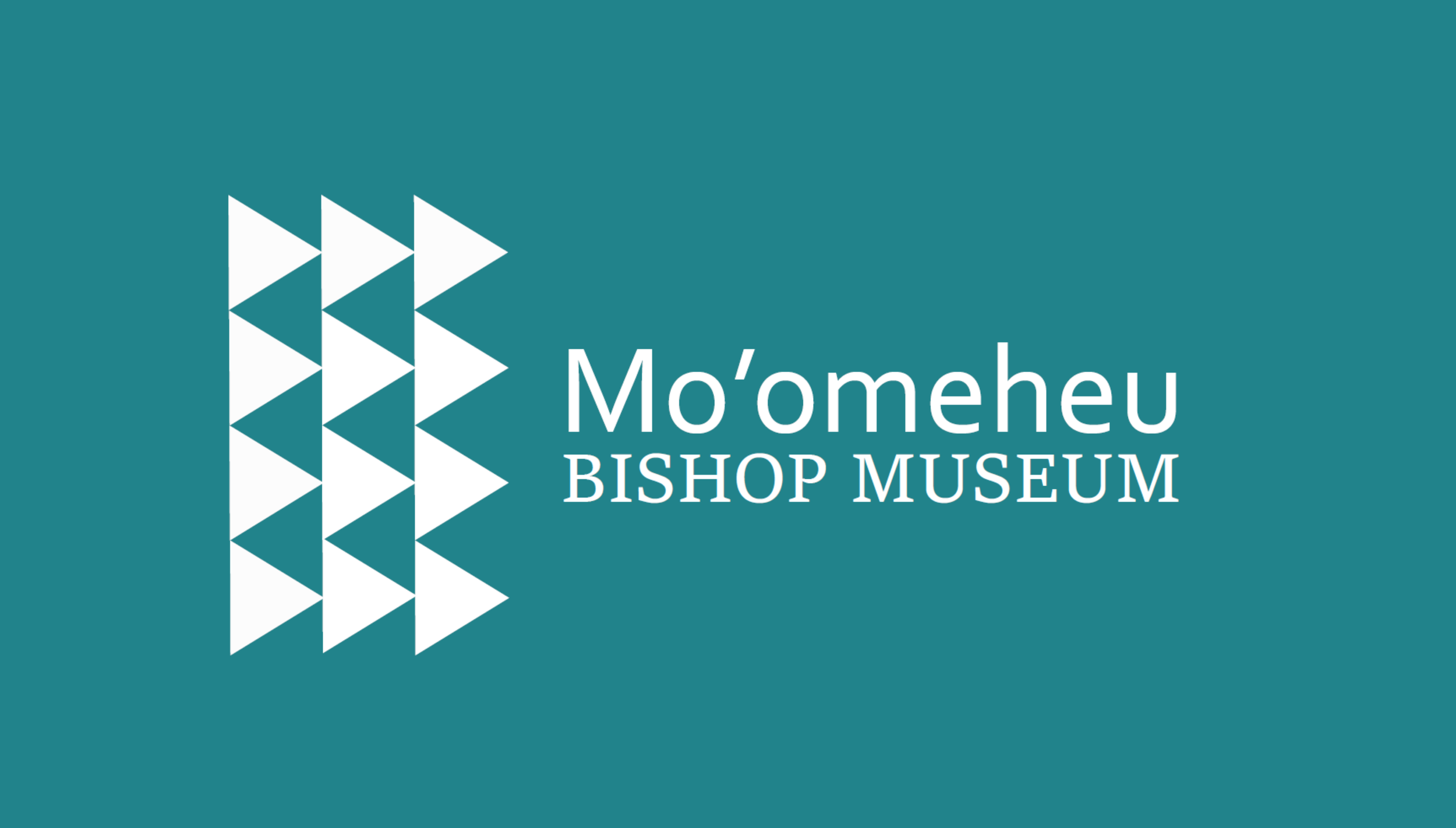
I started by designing a rebranded logo that better signifies Hawaiian identity. Mo’omeheu is a Hawaiian word meaning ‘culture’ and is added to the name.
The triangle symbol is a ubiquitous element in Polynesian art connotating unity. The shark teeth pattern represented by repeating triangles has a strong presence in Hawaiian and Polynesian cultures and is therefore adopted as an abstract mark of the logo.
This variant of the shark teeth pattern points to the right connotating forward movement and the future. This is aligned with the rebranding of the museum to progress to the future while preserving cultural heritage for future generations.
The main logo is in black with variations in branded colors.

Typographic Palette
Next, I selected the typefaces that would be systematically deployed through the design system and set up a typographic palette. I chose sans serif typefaces that present good legibility digitally, i.e., Monserrat for headings and Myriad Pro for body copy.

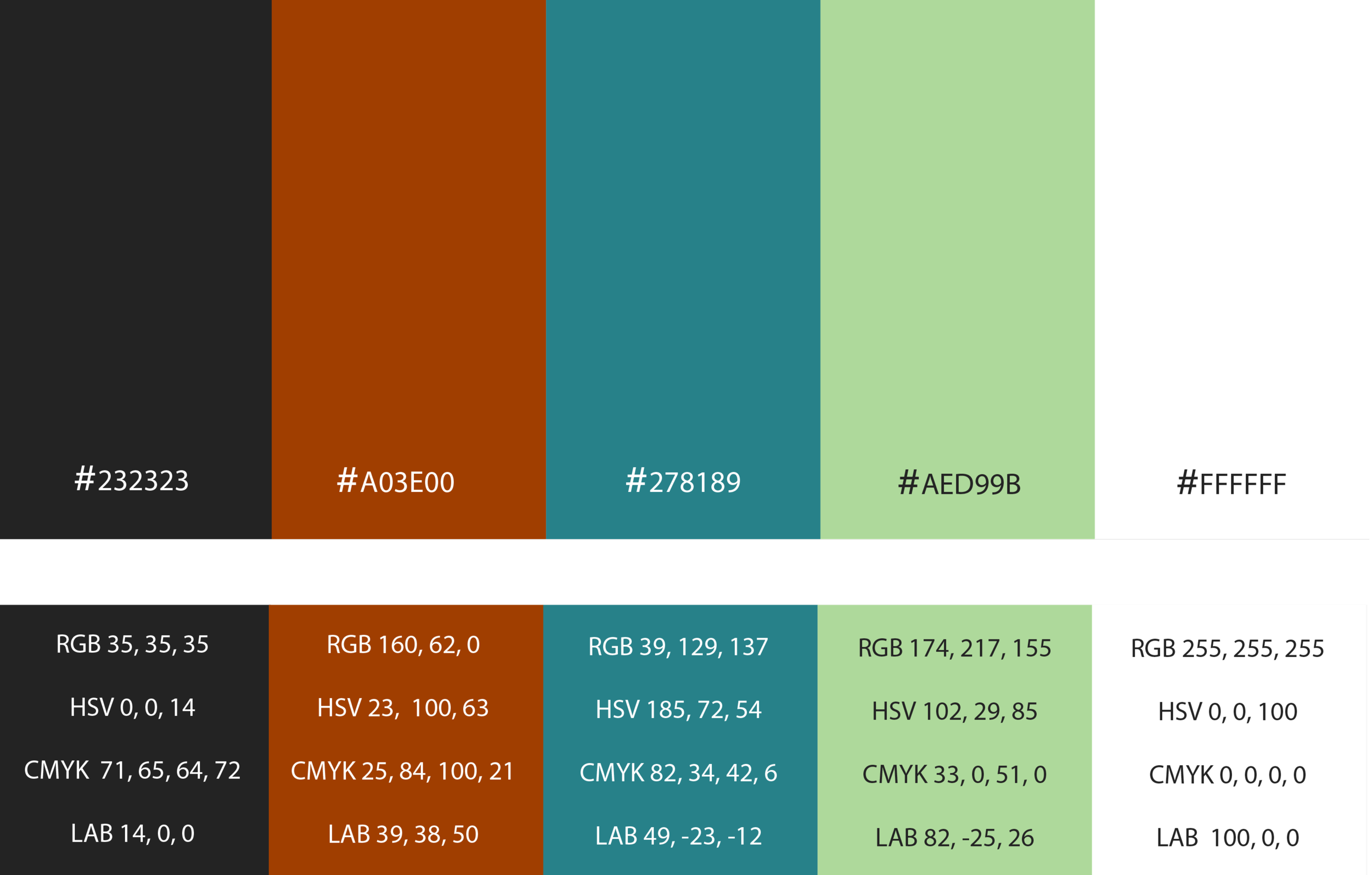
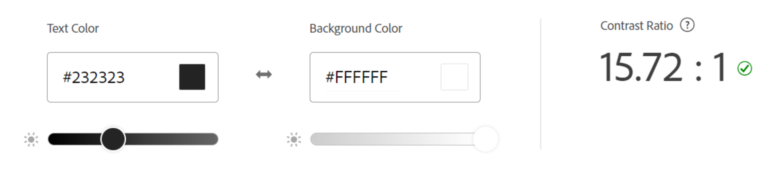
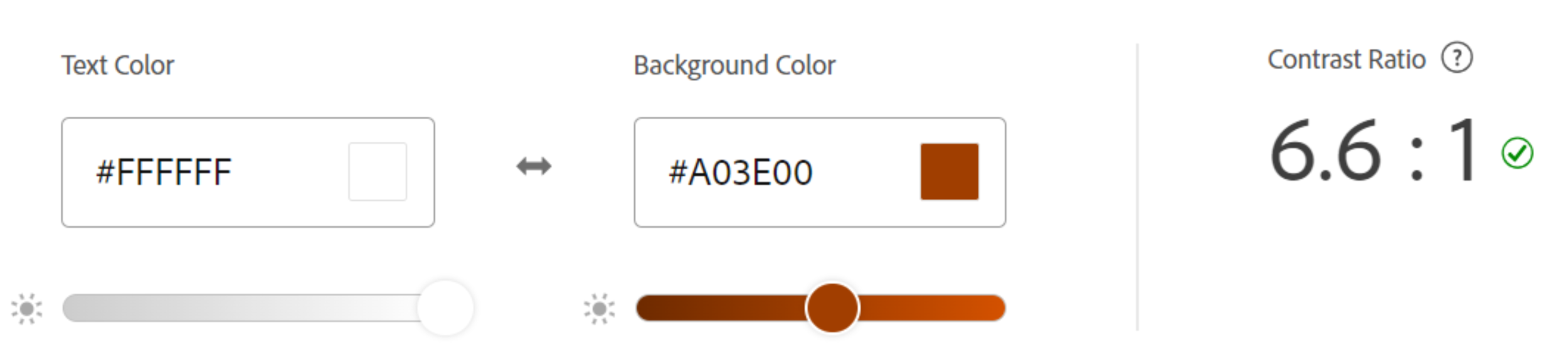
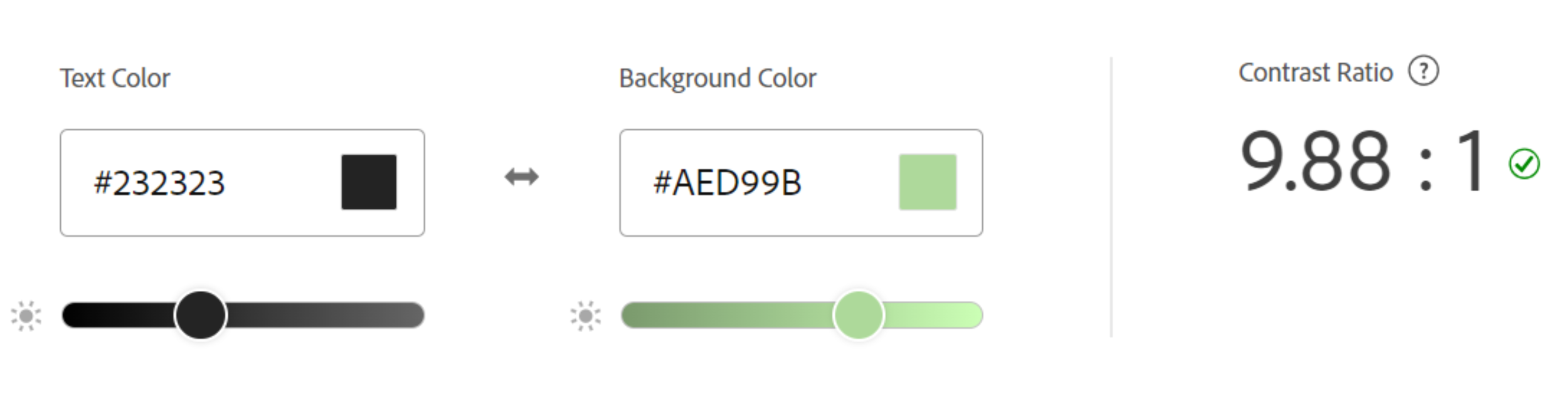
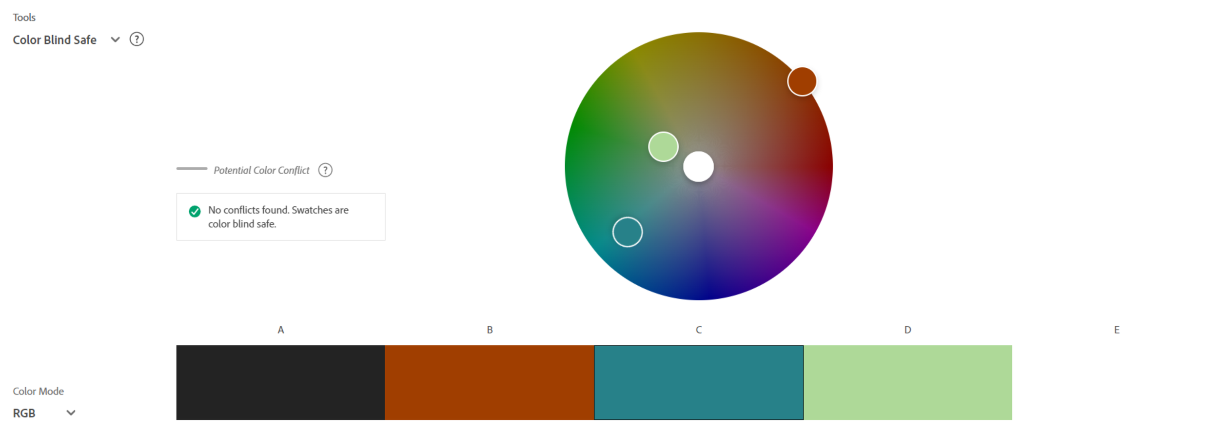
Color Palette
I set up a color palette that is compliant with the standards of Web Content Accessibility Guidelines (WCAG), accommodating viewers with visual impairments.
The palette is composed of 5 main colors i.e., black, white, brown, blue, and green which represent tropical colors.

Stationery System
Additionally, I created a stationery system for the rebranded museum, comprising templates for business card, letterhead, and envelope.
Business card - front
Business card - back
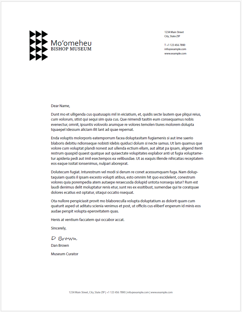
Letterhead
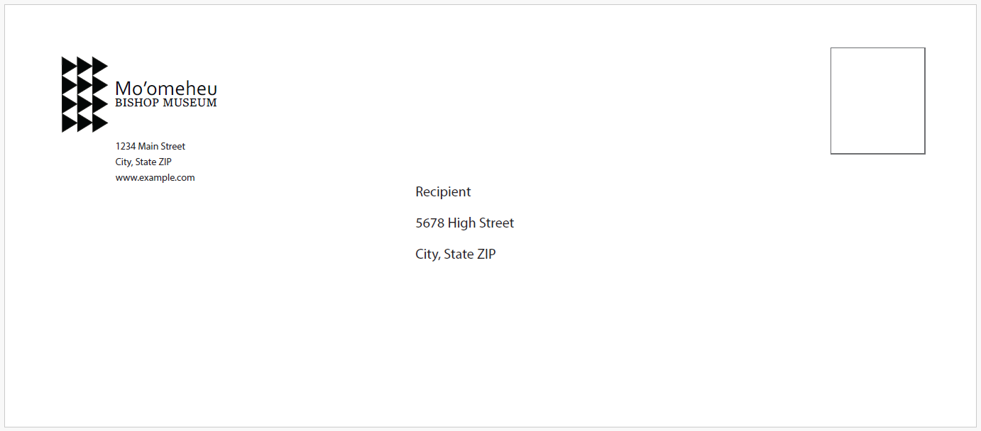
Envelope
KEY TAKEAWAYS & NEXT
To achieve better business success, it's important to gather feedback from the audience and redesign the website to meet their needs and wants.
It is essential to incorporate accessibility standards in the designs to ensure legal compliance and inclusivity for universal users.
Consider the responsiveness of the website when designing multiple platforms to provide a seamless user experience.
The next step is to transform the mockups into a prototype and conduct usability testing.
Ultimately, design the website for mobile devices ensuring responsiveness. Then test the prototype with users for feedback and design improvements.