eZ Grocery is a solution that aims to tackle the issues that users experience from the existing grocery shopping apps. These apps often have cluttered designs and disconnected user flows that negatively impact the shopping experience.
It is a streamlined app that caters to busy shoppers who value their time and prefer tried products. With just one tab, users can create a new shopping list using their past purchases and make adjustments on the fly. The app's performance can be measured by its conversion rate, providing insights into user satisfaction.
eZ Grocery
The Problem: Major grocery shopping applications in the market have complicated designs and disjointed user flows, causing users time inefficiency and frustration. This often leads to shopping cart abandonment. Compiling a shopping list can be a tedious task and requires a lot of cognitive effort. Simplifying the process would benefit both the users and the business.
The Solution: Simple and fast grocery shopping app that meets the needs of grocery shoppers whose time is limited and whose focus is on tried and trusted products, regardless of sales and promotions.
Our design prioritized two key features i.e. creating a shopping list from past purchases and adjusting the item quantity on the shopping list.
My Role:
Ideated the designs, sketched storyboards and wire flow, developed wireframes and prototypes using Figma, and iterated the designs.
Conducted competitive analysis, contextual inquiry, UX visioning, and usability testing.
Project Timeline:
The project was carried out during March–May 2023 in phases and iterations.
1st Iteration
DEFINE
UNDERSTAND THE PROBLEM
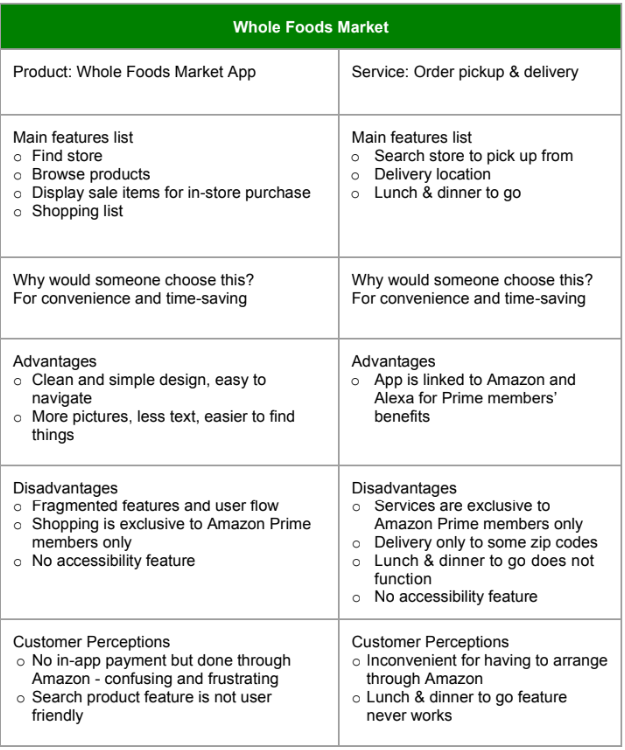
At the beginning of the project, I performed a competitive analysis of two major grocery store chains to understand their online and offline services. Through this analysis, I identified user pain points related to navigating through cluttered designs and disjointed user flows in the available store apps.
Additionally, I carried out contextual inquiry sessions to observe users' behaviors and intents while they were grocery shopping in the stores and online. Key points noted were:
In-store shopping
Users bought the same things as their previous shopping.
Users chose brands that they had tried and liked.
Users didn’t bother using coupons or deals.
Online shopping
Users didn’t spend time comparing prices.
Users didn’t care about deals and featured products but went straight to pick what they needed.
Users had more difficulty finding things on the app since the same products of different brands are not placed side by side as in the store.
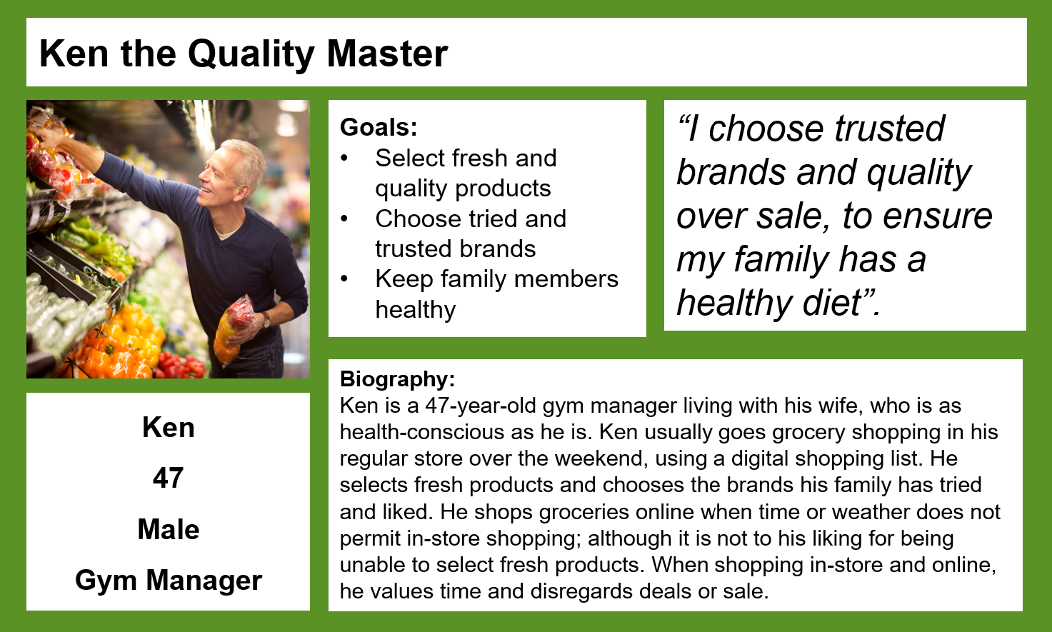
The inputs gathered from the sessions were translated into a UX persona and held as the center of the designs.
DEFINE THE USER
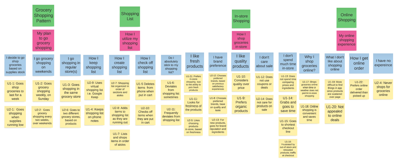
I organized contextual inquiry interview data into themes in an affinity diagram to show patterns of user behaviors.
I then used the patterns shown in the affinity diagram to create a UX persona representing the target user type.
DESIGN
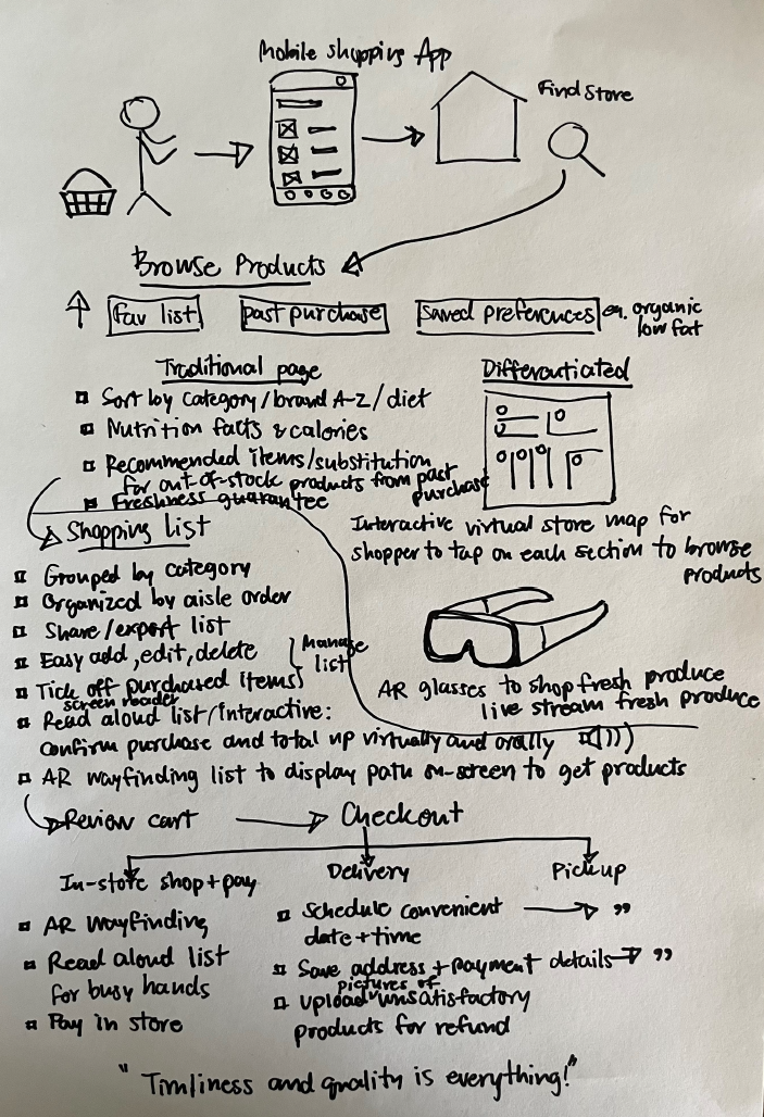
To create numerous ideas, I led a UX Visioning session to brainstorm the product's concepts and features based on the scenarios given.
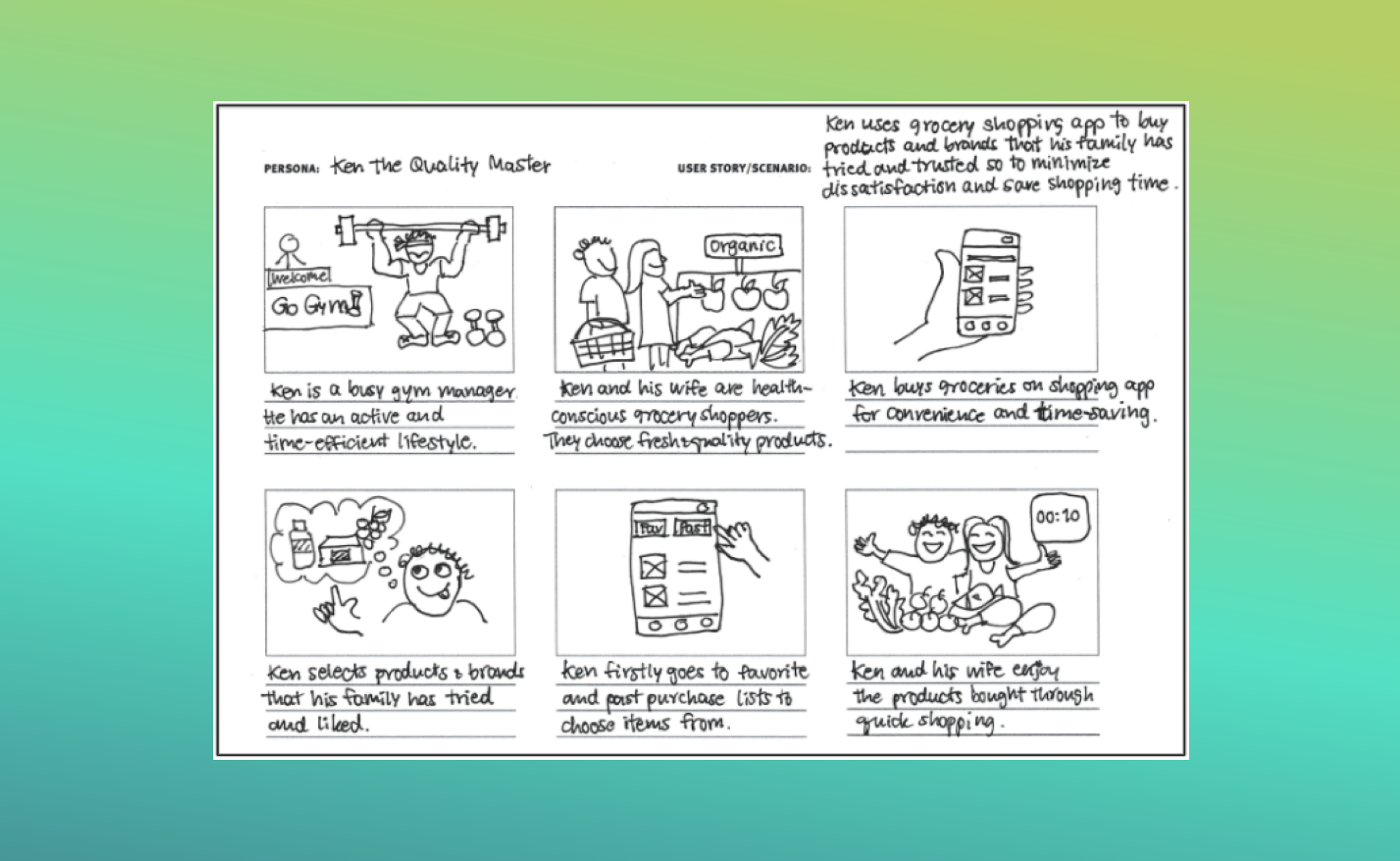
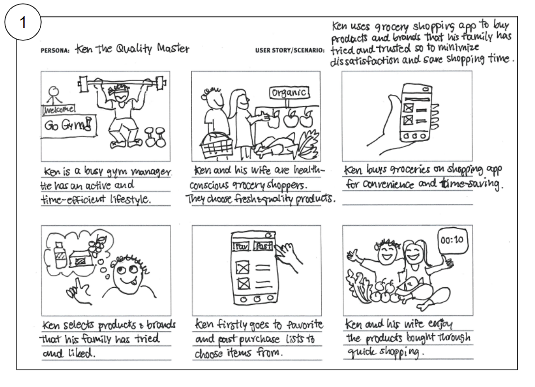
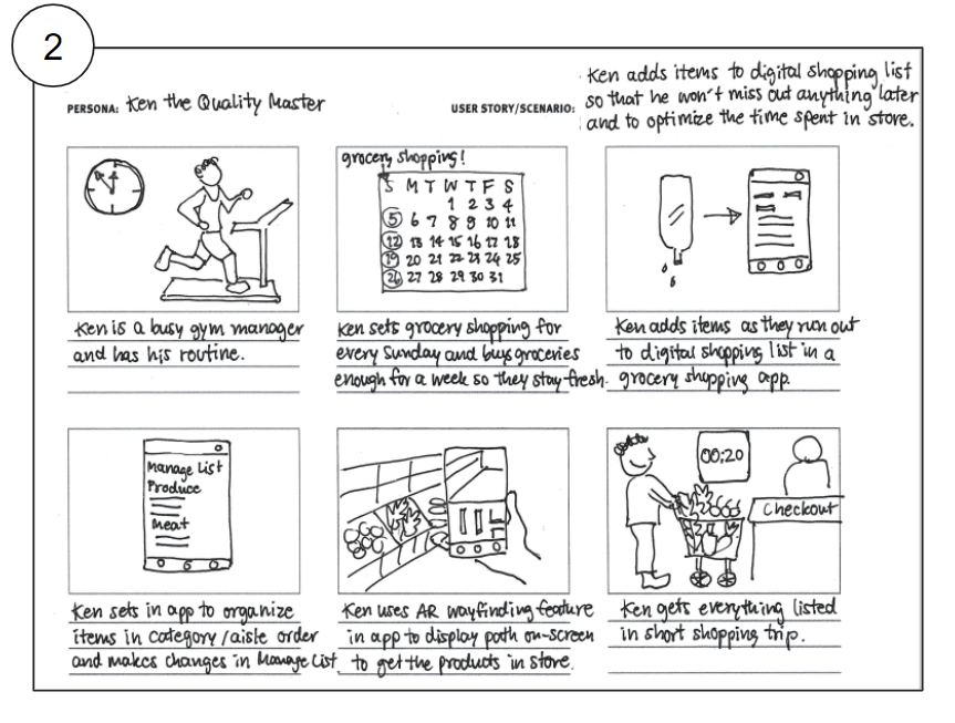
Using the scenarios and ideas derived from the UX vision, I sketched three storyboards to visualize the user’s stories and interactions with the product.
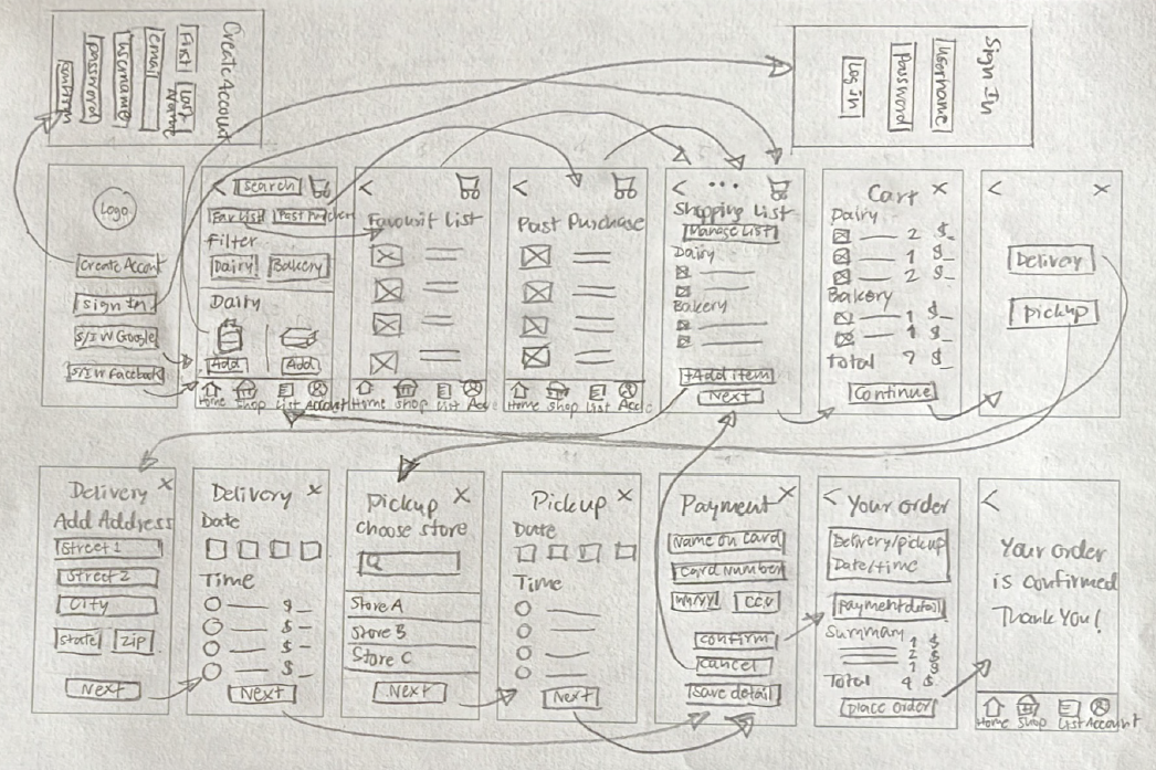
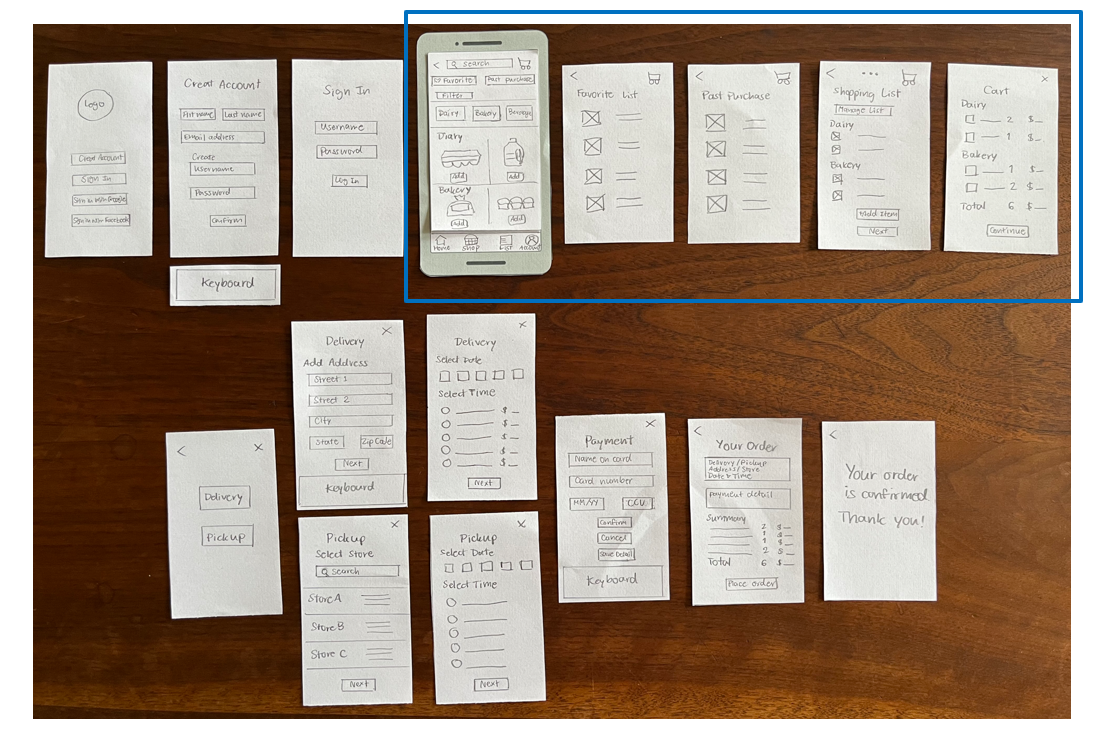
I prioritized Storyboard#1 to draw up a wire flow to guide paper prototype creation.
BUILD & TEST
PAPER PROTOTYPE
I created a paper prototype to simulate a low-fidelity version of the app to test the overall product concept and features with a user.
2nd Iteration
DEFINE
ANALYZE AND PRIORITIZE FINDINGS
The paper prototype test revealed the need for design improvements in the "Repeat purchases and Manage shopping list" features as follows:
Combine the “Favorite” and “Past purchases” buttons into one button called “Repeat purchases” to eliminate the redundancy.
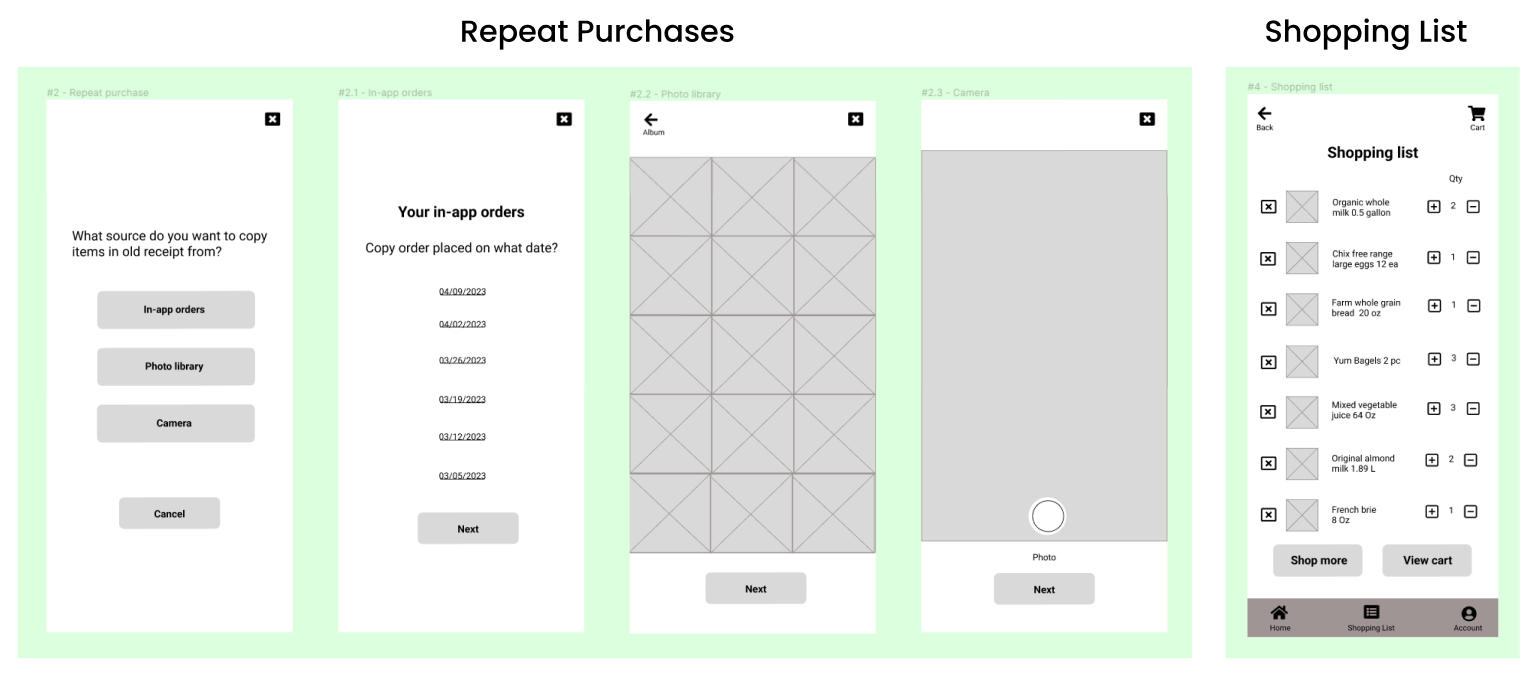
Replace the “Manage list” button with the creation of (+), (–), and (x) buttons to adjust item quantity instantly on the Shopping list screen.
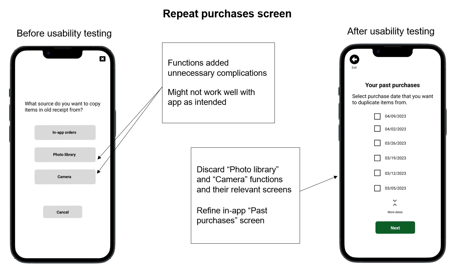
I ideated two new concepts and added them as options to the Repeat Purchases feature.
In-app function to automatically copy items list from past purchases to the new shopping list.
Image-to-text list using a camera to capture and scan items list from physical and digital receipts to the new shopping list.
DESIGN
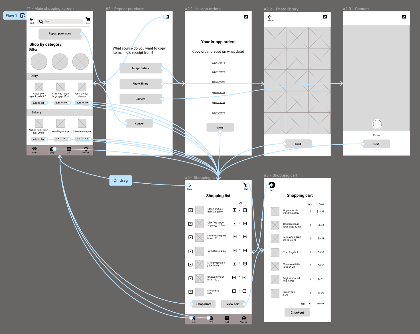
Then, I created the digital wireframes of the redesigned features using Figma.
BUILD & TEST
DIGITAL PROTOTYPE
Next, I built a digital prototype out of the wireframes. Subsequently, I conducted usability testing using both the remote and in-person methods.
USABILITY TEST FINDINGS
Successes
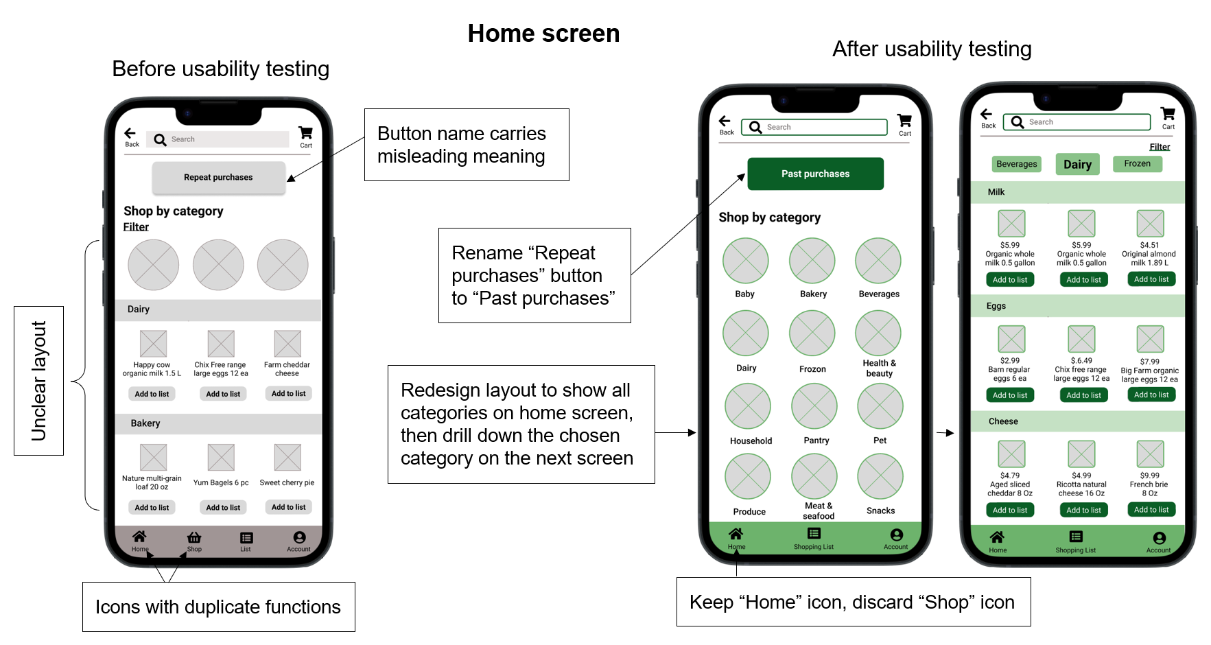
Issue # 1 and Solution
Issue # 2 and Solution
Issue # 3 and Solution
IMPROVED HIGH-FIDELITY PROTOTYPE
User feedback from the usability testing is incorporated into the following refined prototype.
KEY TAKEAWAYS & NEXT
Simple designs are preferred by users. Avoid unnecessary complications and ensure that the solutions are practical and technically feasible.
Pay attention to small details such as labels with clear information and component cues to help users navigate and complete tasks.
Keep testing the usability of the designs and continue to make improvements until all the problems are resolved.
The next step is to iterate the design process on other features, such as the checkout process.
